In this article
A striped blanket palette needs an order and a sense of proportion as well as attractive colors. A narrow dark line can organize a large pale field; equal-width bands can make every color feel equally important. Those are different designs even when they use the same three yarns. Decide which color should lead before choosing the repeated sequence.
These fifteen combinations describe useful roles and width relationships rather than exact yarn quantities or a universal blanket recipe. The pictures illustrate the palettes; screens and room light can change how shades appear. Compare the actual yarns, keep their materials compatible and crochet a complete stripe sample using your chosen pattern. Check the sample in the room where the blanket will live before scaling up the repeat.
1. Cream, sage and warm gray

Cream can carry the largest area, with sage providing the main colored stripe and warm gray acting as a narrow separator. The difference in lightness keeps the green visible without making every band compete. Test the three yarns together under the room’s ordinary light. If cream and gray merge, adjust their spacing or choose a clearer value difference before repeating the sequence through a whole blanket.
2. Rose, oatmeal and ivory
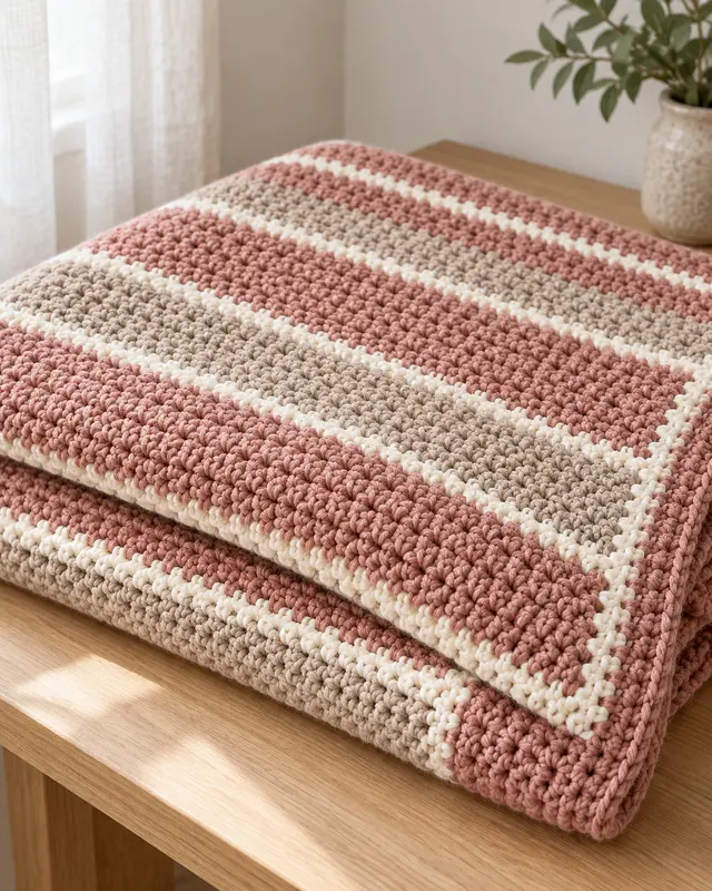
Dusty rose, oatmeal and ivory make a warm, restrained sequence with room for uneven stripe widths. Try rose as the broad color, oatmeal as the transition and ivory as a fine line that prevents the two warm tones from blurring. Lay several repeats together before choosing the order. Keep the yarns compatible in thickness and care so the gentle palette is supported by a consistent fabric.
3. Navy, denim and cream

Navy and denim blue can form the main rhythm while cream creates a readable pause. A broad dark band beside a medium blue band feels different from alternating thin stripes of all three colors. Make the width decision before starting. Inspect the combination in evening light as well as daylight, since two blues that look distinct near a window may appear much closer on a dim sofa.
4. Terracotta, sand and olive

Terracotta, sand and olive give three clearly different color roles without relying on a bright white separator. Equal-width bands emphasize the palette itself, while a wider sand band can calm the result. Compare the yarns against the actual furniture and nearby textiles. A pleasing color grouping still needs a supported stripe repeat and enough of each yarn to complete its planned share of the blanket.
5. Mustard, charcoal and ecru

Mustard can act as a small accent between larger ecru fields and thin charcoal lines. Keeping the yellow scarce makes each appearance more noticeable than an equal three-color rotation. Sample the separator on both sides of the mustard before choosing the order. The charcoal should define the rhythm without swallowing the lighter stitch detail, particularly if the fabric already has strong raised texture across every band.
6. Forest, moss and flax
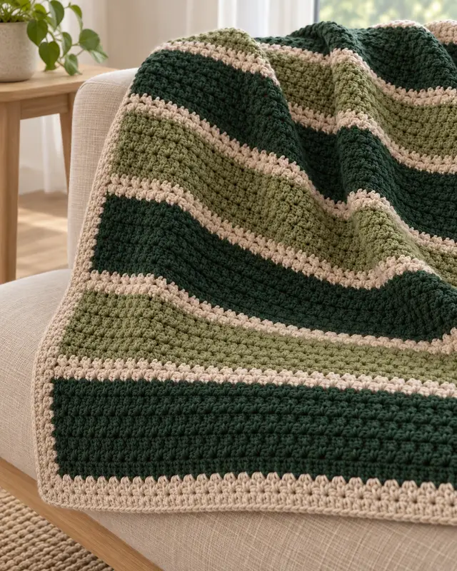
Forest, moss and flax make a muted green progression with a warmer neutral interruption. Use the darker green deliberately rather than letting it appear wherever a ball ends. A flax stripe can separate neighboring greens that would otherwise merge. Work a short complete repeat and inspect the colors from across the room, then decide whether the tonal relationship remains clear enough for the blanket’s intended scale.
7. Plum, mauve and pearl

Plum, mauve and pearl gray can create a dark-to-light progression without requiring many separate shades. Broad plum fields make the palette feel more dramatic; more pearl gives the same colors a quieter balance. Test the actual yarns together, since a gray with a different undertone may change the relationship. Repeat a planned order rather than assuming three attractive balls automatically form a coherent finished stripe sequence.
8. Sky, slate and cloud

Sky blue and slate blue-gray feel distinct when cloud white provides a clean interval. Try a medium slate band between wider pale areas if you want the darker color to organize the blanket. Inspect the white against both blues before settling on its width. A stripe sample reveals how much contrast remains once the yarn is crocheted, which can differ from the appearance of tightly wound balls.
9. Coral, peach and cream
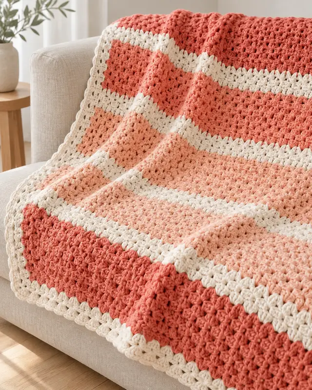
Coral, peach and cream offer a warm progression that can feel soft or lively depending on the actual shades. Give the cream a clear job, such as separating the two colored bands or framing the full repeat. Avoid judging the palette from a screen alone. Lay the sample in the intended room and check whether the coral remains comfortable at blanket scale before buying the full project quantity.
10. Black, ivory and camel
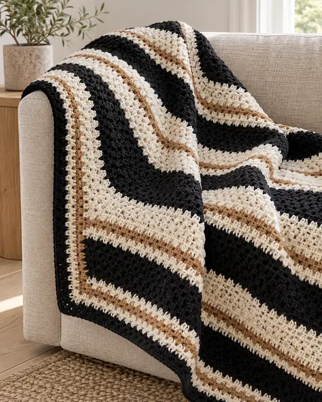
Black and ivory create a strong graphic rhythm, while camel can soften a narrow part of the sequence. Decide whether camel is an occasional accent or a regular third band; those produce different results. Make a sample with the intended stitch texture, because dark yarn can hide small details. Keep a clear repeat record so the bold contrast emphasizes deliberate spacing rather than accidental changes in stripe width.
11. Lilac, sage and chalk

Muted lilac and sage can share a blanket without looking equally prominent when chalk-white rows separate them. Try one color in a wider band and the other in a narrower interval, then reverse those roles in a sample. The comparison helps identify which color should lead. Check the yarns in ordinary light and keep their fiber, thickness and care requirements compatible before committing to the gentle palette.
12. Rust, burgundy and oatmeal
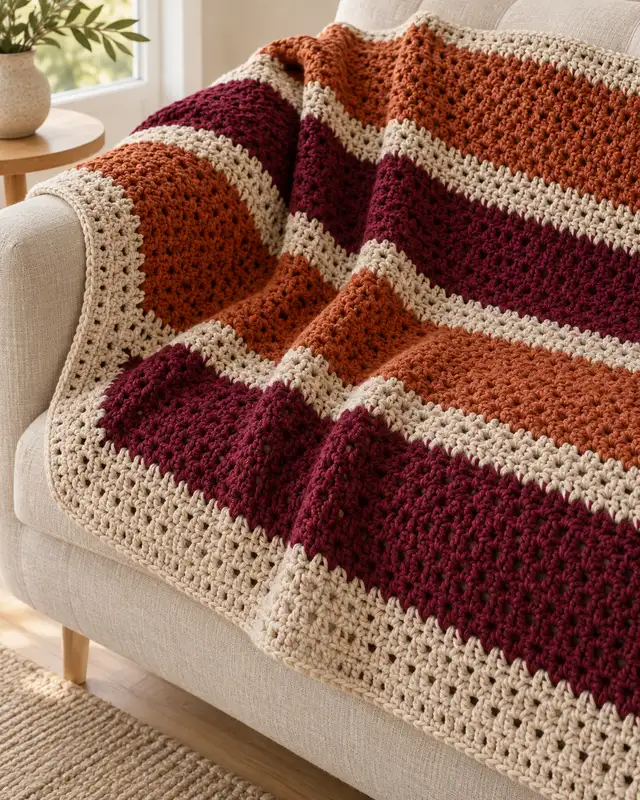
Rust and burgundy sit close enough in warmth to benefit from an oatmeal pause. The lighter stripe can make the difference between the two dark colors more legible. Test whether rust or burgundy should occupy the broadest band instead of assigning equal widths automatically. A small crocheted repeat shows the color relationship and the practical transition, including how many ends the chosen stripe schedule will create.
13. Teal, sea glass and natural
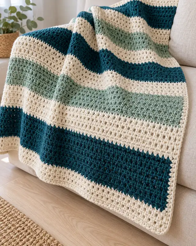
Dark teal, sea-glass green and natural cream create a clear three-level palette. Teal can anchor the larger bands while cream keeps the softer green from disappearing between them. Decide where the lightest stripe repeats and make that rule consistent. Inspect the sample draped as well as flat; folds can bring bands together in a different order from the sequence you see while working on the table.
14. Taupe, cocoa and milk

Taupe, cocoa and milky cream offer a tonal blanket whose interest depends on lightness and stripe proportions. With a small color range, differences in texture or yarn sheen may become more visible. Keep those material choices deliberate. Try a broad light field interrupted by narrower dark bands, then compare it with an equal-width sample before deciding which version suits the room and the chosen stitch pattern.
15. Mixed brights with a navy anchor
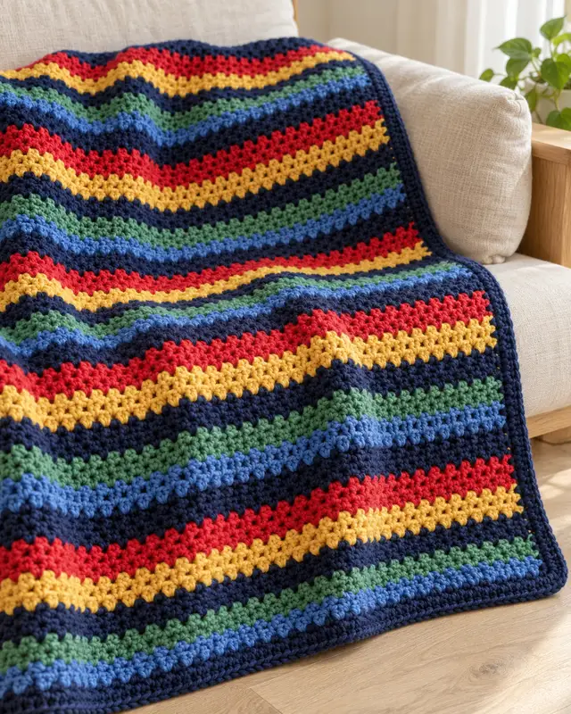
A repeated navy stripe can organize mixed bright remnants into a recognizable sequence. Choose the anchor yarn first and check that there is enough for every planned separator and the finish. The brighter bands can vary within a controlled palette, provided their materials remain compatible. Lay out several repeats before starting; the navy should connect the colors rather than merely cover a shortage discovered halfway through the blanket.
Turn three colors into a repeat you can keep
Assign the roles before the row counts
Choose a dominant color, a supporting color and an accent. Those roles do not have to occupy equal widths. Make two small samples with the same yarns and different proportions, using the actual stitch pattern. This compares a design decision without pretending that a percentage of visible area gives an exact percentage of the yarn requirement.
Check the sequence where it will be used
Put the samples beside the furniture or bedding and look from a normal viewing distance. Check them in ordinary evening light too. If two bands merge, adjust their order, value contrast or width before adding more colors. A phone image can be a useful record, but the real yarn and room remain the better reference.
| Record with the sample | Why it matters |
|---|---|
| Color order | Keeps the rhythm consistent after interruptions |
| Actual row count per band | Turns a visual idea into a repeatable sequence |
| Yarn details and care | Makes substitution decisions more informed |
| Finished sample measurements | Connects the repeat to the chosen blanket pattern |
Use the blanket planning guide for the larger project. If the supply is mostly remnants, compare the scrap-yarn layouts before choosing a stripe schedule that needs more of one color than you have.
- How to Join Granny Squares and Finish Blanket Edges
Plan a granny-square blanket join with a four-square practice sample, seam checks, junction guidance and a deliberate foundation for the blanket border.
- 27 Scrap-Yarn Crochet Blanket Ideas for Leftover Yarn
Plan 27 scrap-yarn crochet blanket layouts, from motifs to stripes and panels, with practical checks for compatibility, usable lengths, joins and borders.
- 23 Textured Crochet Blanket Ideas with Raised Stitches
Compare 23 raised-texture crochet blanket ideas, from ribs and waffles to cables and motifs, with useful checks for weight, reverse sides and joins.
- 17 Chunky Crochet Throw Ideas for Cozy Bedrooms
Explore 17 chunky crochet throw ideas for a cozy bedroom, from ribbed bed-end accents to patchwork blankets, with practical notes on weight and finishing.
- How to Choose Blanket Yarn, Hook Size and Yardage
Choose blanket yarn and a hook using your pattern and a finished swatch. Learn a practical way to estimate yardage, borders and the number of balls to buy.
- Crochet Blanket Ideas: Style, Size and Skill Guide
Choose a blanket direction by the way it will be used, the construction you enjoy and the material decisions that determine its finished feel.
- 25 Modern Crochet Blanket Ideas for Living Rooms
For restrained pattern, compare the quiet grid and windowpane direction. For bold shape, shortlist the offset blocks. For tactile depth, investigate a ribbed or waffle-style surface.
- 21 Crochet Baby Blanket Ideas for Beginners
For a first rectangular project, compare the plain keepsake and broad bands. For a joining lesson, look at the four-panel direction. Save diagonal construction until you can follow its shaping.
- 19 Granny Square Blanket Layout and Color Ideas
For a first layout, choose an equal straight grid. For a strong colour plan, compare diagonal bands and the centre diamond. For more assembly, examine the mixed-size direction.